Using UX Design to offer automated planning in an intuitive, flexible, and secure way.
InterControl: Incorporating Personal Financial Management into Banco Inter
How can we offer personal financial management to help reduce expenses and improve quality of life?
Understanding the scenario
The financial market in Brazil is continuously expanding, especially in the fintech sector, where even with the crisis these companies grew by about 34% in the last year. We can find this example in Banco Inter’s 2020 operational report, in which the number of accounts reached 8.5 million, indicating an increase of 108% compared to 2019.
On the other hand, the survey carried out by the CNDL/SPC Brasil shows that 48% of Brazilians do not control their expenses and the remaining 52%, who have some type of control, do not always do it properly. In addition, with the impacts caused by the pandemic, 80% of Brazilians had their finances even more affected, aggravating the scenario of the presented context and further reinforcing the importance of cost containment. Among the main reasons that contributed to this, we have:
To further increase its growth, Banco Inter's motto is “Creating what simplifies people's lives” and seeks, through this, to offer several features that can facilitate the daily lives of its customers. In its application, functions such as money savings (cashback) and income (investments and savings) are available, but there is a lack of a solution for managing users' expenses and helping them to reach goals, which we identified as still being a problem that plagues most Brazilians today.
Deciding on the main project objectives
Our project was created to solve this financial management problem, trying to link the differentials offered by Inter with the new functionality within the application.
We believe that, without expense reports and with consumption incentives, the user can lose personal control, directly harming the company due to a high delinquency rate. Thus, by providing greater adherence to the management service, we generate greater user control over their purchasing power and, consequently, improve their quality of life by achieving effective results.
With that, our main points to attack were:
Solve the complexity of users to understand and manage their plans, expenses, and personal goals;
Cooperate with the organization, economy, and achievement of goals;
Decrease the amount of time people spend planning.
Defining business goals
Regarding the business issue, we seek to use the S.M.A.R.T. methodology, which allows us to delimit specific, measurable, achievable, relevant, and temporal objectives. The data were based on the 2020 Annual Report — Inter, as access to the most accurate updated information was not available. Thus, we will verify the veracity of the data from monthly reviews.
Therefore, we aim to:
Increase by up to 3% the registration of new accounts at Banco Inter in up to 6 months;
Decrease the number of inactive users by 2% in the first year;
Increase revenue from Inter Shop sales by 2% through tips and ads in the first quarter.
Getting to know users
From a better view of the market and with our projected goals, we developed our personas, considered fictional characters, created to represent the majority of users, who fit within a pattern in a certain niche. Based on them, we were able to identify the main difficulties and complaints of our target audience regarding financial planning and think of opportunities and solutions to heal their pain.
Thus, we established 2 main personas that were realigned after our quantitative and qualitative research.
User Personas
User Persona 1
User Persona 2
Context of the user's financial life
Once our personas are known, we seek to better understand how each of them solves their current financial problem, that is, without using our solution. For this, we used the user journey approach, which allowed us to visualize possible opportunities for improvement that could aggregate and direct us to real problems.
User Journey 1
User Journey 2
The stages of our users coincide, changing only the details of each one's experience. Both perform daily work or consumption tasks and, due to this, they are eager to learn how to deal with the bills to live better, achieve their goals/objectives, get an extra reserve or even invest. However, they are unaware of their limits and find a major barrier: the lack of control and/or understanding of small financial management strategies.
First validation step
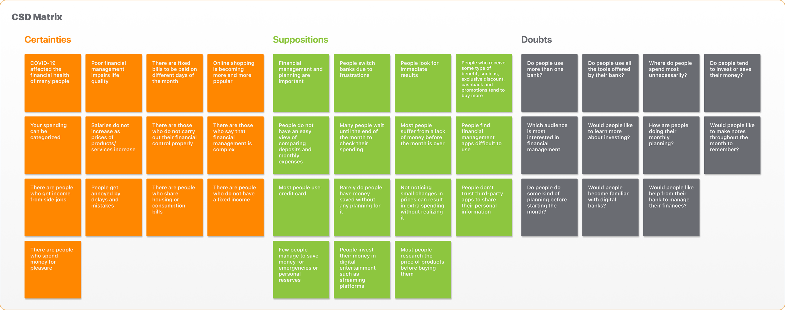
After defining the personas and their journeys, we used the CSD matrix to list certainties, assumptions, and doubts. Then, we prioritized these last two with the help of the impact vs knowledge matrix and developed hypotheses that served as a basis for designing our initial quantitative research questions.
Getting closer to the public
At this stage, to understand the profile of our audience, we prepared a quantitative survey in the form of a conditional questionnaire based on the hypotheses formulated in the previous stage of the process. Thus, it was possible to understand whether these hypotheses corresponded to the needs of our real audience, validating or refuting them.
Main results of quantitative research
We got 149 responses in total and by analyzing the form we were able to capture crucial data for the development of our functionality:
Subsequently, we carried out a second survey, also in the form of a questionnaire, to understand the current satisfaction of Banco Inter's customers and to understand how the company has contributed to their management.
Creating proximity to the main correspondents
After analyzing the results of the quantitative surveys, we selected 6 people from the questionnaires, according to their answers corresponding to the majority, to participate in the qualitative research, as we felt the need to better understand their motivations, impediments, and financial objectives.
We formulated semi-structured research (interview with a script and the possibility of new questions), carried out through video calls, and for each interview, we had the participation of 2 members of the group. This allowed us to optimize data collection and exercise active listening to each of the responses.
Our biggest learnings from the research were:
Studying the solution alternatives
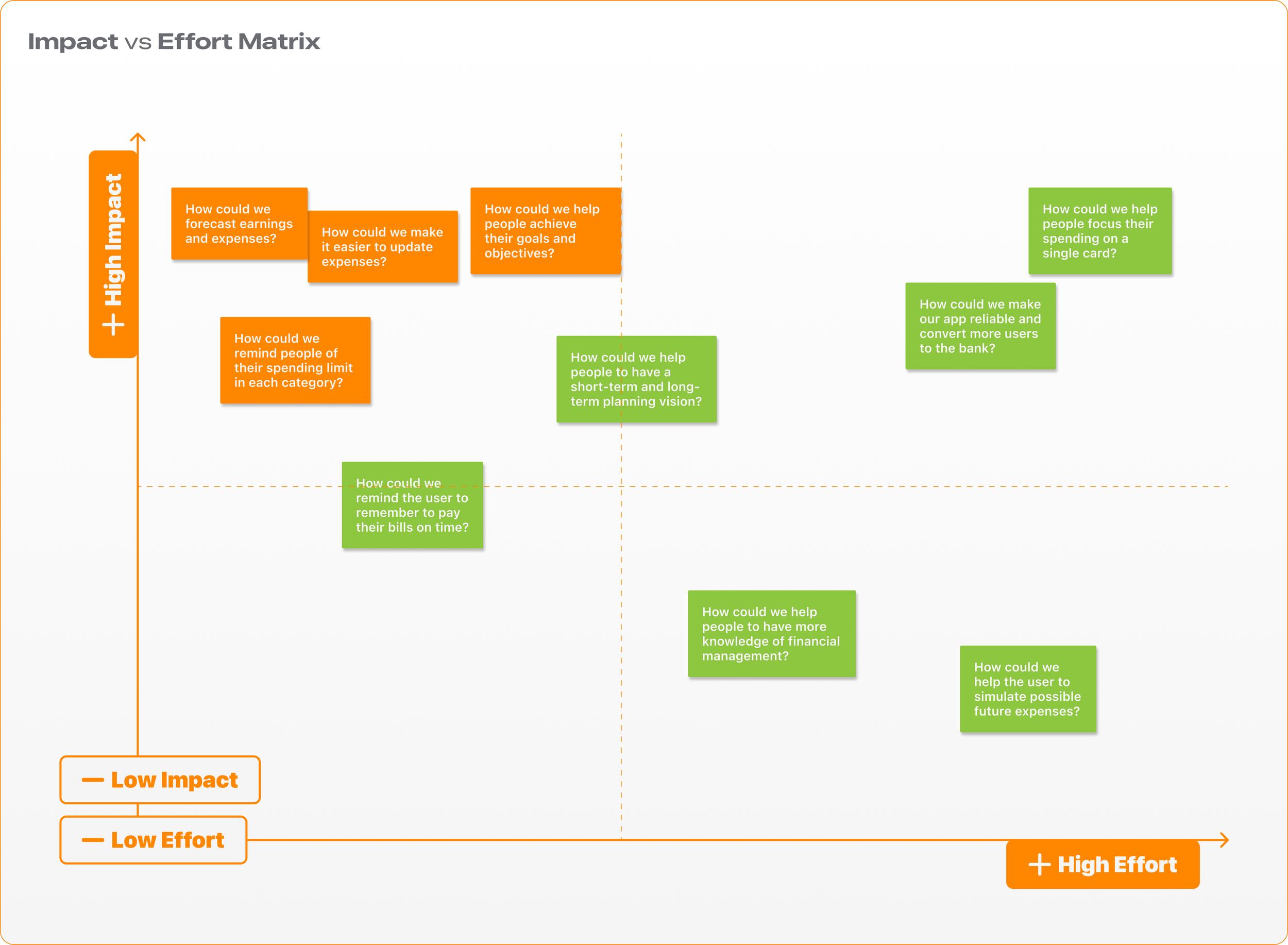
Observing the lessons learned through field research, we built a framework using the “How could we” technique to better understand our opportunities and insights. Next, we list each of them in an impact vs. effort matrix to identify which ones we should focus on during development, taking into account the following aspects:
How much value would it bring to the customer;
How much return would it bring to the business;
How much effort would be required for technical feasibility.
The priorities (in orange) and insights were:
How could we predict earnings and expenses?
High impact: it is one of the most important pieces of information in planning to generate complete control, giving autonomy to the user.
Very little effort: as the amounts are already recorded by the bank, so just segment them and make improvements as reminders.
How could we make it easier to update spending?
High impact: it saves users time, which they used to do manually, and avoids errors, both in terms of memorization and uncontrolled expenses.
Little effort: because it will use the statement data and accounts that are already in the bank, sending notifications according to the limits registered by the user.
How could we help people achieve their goals and objectives?
High impact: people are eager to achieve achievements in their lives and a tool that facilitates the management of progress for this will be ideal for optimizing users' time and quality of life.
Little effort: we will work with the “savings” system as in “investments” that the bank already has, only being separated for goals.
How could we remind people of their spending limit in each category?
Significant impact: the alert when a user gets close to their consumption limit will be a significant differential, especially after they are more used to the functionality, to save money and be attentive to planning.
Very little effort: we will use the app's notifications as soon as the value reaches 90% of consumption.
Analyzing the competition
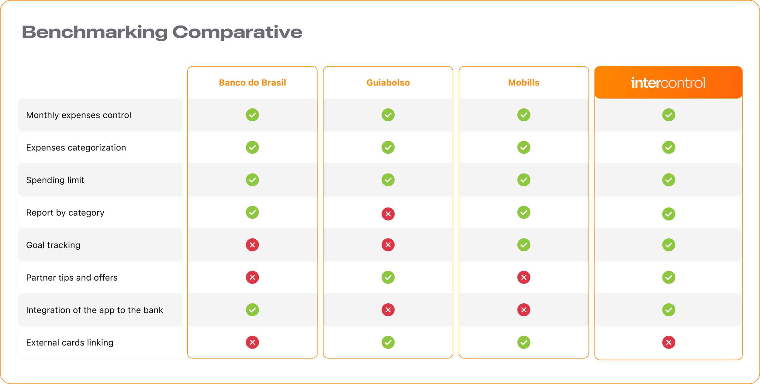
We carry out a survey of our possible competitors as a starting point, in order to understand the solutions already on the market. From this, we identified three applications with a proposal similar to ours, with Banco do Brasil being the only application that has the functionality integrated with the bank itself. In the table below we show some of the features present in competing applications and what we intend with our new functionality within Banco Inter.
Thus, we could see that, in addition to the proposal to improve personal financial planning, most applications on the market do not offer a complete solution, bringing to us the potential to improve the experience of Inter users and attract new customers to the bank.
The first step to the solution
With our prioritized opportunities and the Benchmarking of existing solutions on the market, we used the “4-Step Sketch” for prototype ideation. Thus, by making an empathic analysis of all the information collected throughout the project, we realized the need not only to help users in controlling expenses but also to better direct them towards the achievement of personal goals and objectives.
With that in mind, we started to create new functionality for Banco Inter and focused on basically dividing it into two main sections: planning and goals.
Based on this perspective, we developed our first sketches, following the pencil before pixels principle:
If you would like to check out the low-fidelity prototype click here.
Testing the Basics with Users
To test our low-fidelity prototype, we used the Marvel App and recruited 7 people, users and non-users of the Banco Inter.
The tasks we asked participants to perform were:
The tests were mostly successful, but we were able to observe some important lessons, based on the main difficulties faced by the recruits:
Badly located general report button, which made it difficult to find;
Some words that did not make clear the function they represented;
Absence of signage in some clickable areas;
Ambiguity in the way we dictate one of the tasks that should be performed.
We believe it is essential to make these points clearer to make our product more intuitive. Therefore, we will develop the wireframes with the necessary adjustments to visualize how we can solve these difficulties in the future.
Creating wireframes for a better understanding
Before going to high fidelity, we created our wireframes, a step that allowed us to better visualize the skeleton of what would be built next since several changes were considered in the first usability test. In addition, we were able to focus more on details that had not been considered before, as well as predict the application of some elements that are already used by Banco Inter and bring them to our functionality. Finally, we adjusted the flow between screens to verify which paths would be possible for the user within our solution.
The main changes from the sketches to the wireframe were:
Review of general reporting functionality for expense reporting;
Addition of the recipes page;
Statement of expenses;
Review of essential information;
Usability flow review.
Despite this, we believe that the consolidation of the visual identity still represents a fundamental issue for the best usability of our solution by the user and that's why we decided to carry out the next usability test with our high-fidelity prototype.
To see the wireframe in full, click here.
Bringing the project to life
With the wireframes ready, we moved on to building our style guide in order to consolidate the look of our functionality and make our elements scalable. As the objective of our solution is for it to be part of the Inter bank's own application, without having to change the current standard, we are based on the same color scheme, fonts and standards related to the visual elements of the application, since they do not make their styles available to the public. Thus, we managed to maintain the consistency of the interface and focus on faster and cheaper technical feasibility.
Logo
Color Palette
Typography
Icons
Buttons
Forms
Grid
Getting there: developing our prototype
With the wireframe and style guide defined, we were then able to take the next step and create our high-fidelity prototype with the necessary changes. The purpose of this step was to create the interface for a test version of the application and then validate the decisions made so far.
With that in mind, we kept the main planning and goals sections, detailing some more important functions for user interaction with the product. They were:
In addition, we added other details that we believe are important for the efficiency of the functionality as a whole, such as:
Walkthrough to quickly explain what the functionality is all about;
Interaction details such as action chevrons, scrolls, error prevention modals, explanatory tooltips, and update feedback;
Details of some elements and screens.
You can browse the prototype below, or view it by clicking on this link.
Testing high fidelity with users
For the second usability test, we were attentive to understand not only the changes observed after our low-fidelity test but also our choices regarding the style guide and other elements. With this, we were able to understand its impacts on the usability of the product by users and, consequently, see if it is being a clear and intuitive experience.
In total, we tested our prototype with 11 people, dividing them into 2 distinct groups: a journey of income, expenses and accounts payable and another of goals and monthly planning. With this, we were able to have an overview of the entire navigation of our function and ensure as much learning as possible.
As a result, we observed that many of the difficulties presented were due to some failures in prototyping and the flow of questions to respondents in conducting the test. However, we have also gathered some important opportunities that should be prioritized for the next stages of the project:
Rename and redesign the main card in evidence so that users can more quickly find our functionality within the app;
Adjust the look of the “Revenues” section to make the difference between the information of recipes already received and the reminders of recipes to be more clear;
Review some words that have been shown to be confusing in functionality (income, expenses, payable, income receivable, confirm/delete income receivable, category name under expenses).
UX Writing
With the changes made, we realized that it was essential to carry out new tests, this time focusing more on the Writing of our solution since this generated many doubts for users during the high-fidelity test. Scenes for the next chapters.
What will we do next?
We understand that our project is just the beginning of great functionality and that, to offer an increasingly complete experience to its users, new research, testing, and development will be necessary. In addition, we understand that some issues may be more costly at the moment. As the next steps, we think of some improvements and implementations for the functionality:
Conduct a Daily Study to understand if the product facilitates the user's day-to-day;
Study feasibility and develop a desktop version;
Create an ecosystem between local businesses and Banco Inter to offer cash back at InterShop via user geolocation;
Design cash back redemption gamification, providing exclusive offers for frequent users, as well as total savings with the function;
Study the feasibility of adding new features, such as management of transactions external to Inter; shared management between users; forecast calendar and scheduling of entries and exits; simulation of expenses; optimization of the “Receivables” function to automate future revenues; savings comparison percentage over the previous month.


